I was going to write about Walt Disney Studio's collaboration with the Ad Council on a series of PSAs--Sleeping Beauty has teamed up with Smokey the Bear to prevent forest fires (logical!)! Fat bear Baloo is the poster child for healthy living (makes sense!)!--but when, long story short, during my research I ended up reading pages of "The Walt Disney Company's 2008 Corporate Responsibility Report," I kinda lost my mojo. So instead I wanted to pose this thought:
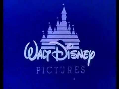
As a child, whenever I saw the logo for Walt Disney Pictures, I never knew that it said Walt Disney. Or, I guess I kinda did, on some intuitive level, because, you know, duh. But as it's written in Walt's own handwriting, I never recognized the "D" in Disney for what it was. It always looked like...I don't know, a backwards "G" or something. (Hey, I didn't think about it that much.) It was only years later that it hit me that it was, in fact, just a "D" with a little loop around the front. Whoa. Wacky Walt.
Even still, nowadays, I sometimes find my brain reverting back to my 7-year-old self and I just can't see the "Disney" in "Disney." It's that damn D! It has far too much going on around the straight line/the left side; it seems so...off balance.
I know I'm not alone on this. Someone who shall remain anonymous* said she had a similar problem with, you know, reading the D in Disney. I wonder: did anyone else ever misread or simply fail to recognize a popular phrase or logo because of the typeface?
This post is best read with musical accompaniment: SpinitLet'sbeginitBear'n'grinitWhenyou'reinitYoucanwinitInaminuteWhenyouspinitspinitspinit!
*It was Claire.

No comments:
Post a Comment